
Heya Nesters!! Well as promised in yesterdays post, I wanted to chat with you all about fabric and color. We all know that Satine {my lovely latest project that you can see here and here.} started out as a lovely sun-bleached magenta velvet.


There was no question in my mind that this chair had to be velvet. The curve and silhouette of the chair speaks so strongly to its character that I didn't want to compromise it by putting a printed fabric on it. So my beloved damask prints? Out the window! Do you know what I mean? It's like the old fashion adage: "You want to wear the dress, not have the dress wear you." We want to put her in a nice sleek dress where we can see her form show through.
Enter: Fabric Swatching Books.
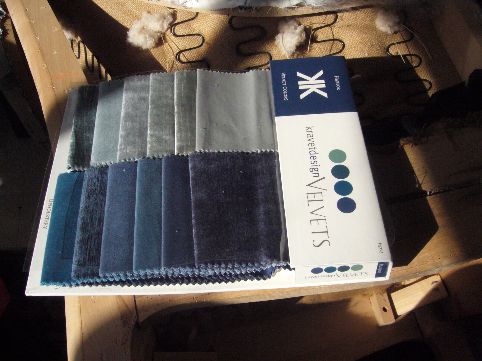
My school carries Kravet fabrics in all different finishes, colors and patterns. I headed straight to the velvet books. And matte blue was the name of the game. Being that this was Mom's chair and her gift, I let her choose the color scheme: Dusty Blue.

And this was the color that I almost went with. It was bordering on a turquoise, but it was classic and a very "sweet" shabby chic color. Now I am going to go on the record and say, I love me some shabby chic! White, ruffles, dusty rose and dusty blue-- the works! Bring it! But this chair was just screaming to be more regal.

As I was on the cusp of ordering this dusty blue {Not a cheap decision, mind you. The dipping-into-the-"rainy-day"-account kind of not cheap} and I stopped myself for a second look at the books. I needed a saturated color. Maybe I was so inspired by doing research for Friday's post but I was envisioning the chair being this statuesque piece instead of a dusty color, will lend itself to blending in and looking "old" fast.

Then I started looking at this teal. Gorgeous isn't it? But this would have made the chair super modern with this classic shape and I didn't necessarily want to go there. I want it to look refreshed and beautiful but I didn't want to mock her and make it a joke. So even though, I would LOVE to cover another chair in this color, it wasn't right for Satine.
Navy. I needed Navy. Give me Navy.
 |
| Wow... sorry for the blurrrrr.... |
This is the most classic, royal navy blue you can find. It was too staunch and straight-laced. It was totally a prim, almost prissy, color. I needed to find the happy medium between all the two colors.
And then I found it. Satine's perfect dress color.

It is deep and rich and saturated. It was a navy color {this harsh light is making it look more teal} and it had a smidge of the yellow from the teal in it and it was just glorious.
I was so confident in my decision I wrote a check on the spot for enough to cover the bulk of it and I would write the remainder when we got the final quote from the supplier. In case you were wondering how you could get some for yourself here are the details from the back of the swatch. I would suggest finding your local Kravet supplier and have them order it for you. My guess is that Kravet won't sell it directly to individuals. {But don't quote me on that....}

Pattern: 14743 and Color: 55
So there you have it, Nesters! What do you think? I know a couple of you have voted for navy are you happy with the final color choice? Do you wish I had gone back to magenta? Or maybe a golden yellow would have been fun? What would you have gone with it you were in my shoes and could pick ANY color, pattern, fabrication, you name it! I'd love to hear what you envision Satine looking like, so dish!


While I am teal - teal - teal all day long, I looove the navy - ESPECIALLY that exact shade! So classic and timeless. Can't wait to see the final product!
ReplyDeleteI am also a teal person, but I do like the color you picked and can't wait to see it!
ReplyDeleteNormally I am a teal/turquoise person but I agree that navy is best for Ms. Satine.
ReplyDeleteShe looks like she's been through a lot in her life and reupholstering looks challenging, so a saturated color like navy would be perfect to ensure she's looking great for a long time :)
Oh I think Navy was by far the best choice! Classic, classy, mmmm just lovely!!
ReplyDeleteThanks for stopping by my blog. I see that you are a fellow apartment renter. Hooray! There are not enough of us blogging! :)
ReplyDeleteThe upholstery class sounds like so much fun! Excited to see the finished result of this project. I admit, I'm a huge peacock/teal fan. Actually, one of my apartment walls is this color but I do admit that the rich navy looks like a great choice!
Good luck with your class and this project!
It will look amazing!! Can't wait to see the afters...
ReplyDelete