

I trusted Matt completely to choose the color for the living room and hallway. And of course, he got to choose his own color for his office. So those were already up and painted before I hit the Behr color wall. Matt pretty much gave me free will to choose whatever color I wanted for our Master bedroom and I also had free reign on my office color.
The office was easy. I knew I wanted something similar to the minty color I had in my room in my old apartment. The color I ended up with was called Clear Pond...

Isn't that so crisp? {Obviously this is not my office, this is the virtual preview from the Behr website.} I cant wait to see it go up! That was the easy part.
The toughie was the Master. I really wanted gray. I mean I realllllly wanted gray. But Matt's office was painted a slate blue, and he didn't want the two rooms to look too similar. So we opted to start looking at other colors. We also agreed that although we both liked chocolate brown, our bedding was also chocolate brown, and would be camouflaged, probably requiring us to feel around for the bed every time we walked in. That just won't do. No brown.

Keeping our chocolate bedding in mind, we thought Behr Starless Night would be a nice compliment. But upon closer look, it was incredibly dark and they really didn't have another tone of the color that would be more fit for our room. I was disappointed.
So we went back to the idea of gray, but decided to head a little darker into the gray spectrum. We pulled out Antique Tin and we both loved it! I mean L.O.V. E.!

We were so excited! Finally a decision! Antique Tin was the winner. Two gallons came home with us and I left the boys to go visit our friends at West Elm since they were having a sale, when my phone rings. It's Matt saying, "Babe, don't get mad, but we can't use the gray. It's way too dark. We can't use it. I'm going to go pick something else out." I told him I trusted him to make a good choice and I kept browsing. Five minutes later I get another call, "Okay, you can go pick it out under 3 conditions: 1) It's not brown, 2) It's not gray and 3) It's not dark." I can do that, easy peasy lemon squeezy!
HA! If you caught a glance at my tweets around that time, I started having a panic moment. Talk about pressure! Make the decision for the both of us, that we will have to live with every day for a long time. When you narrow those points down, no brown, no gray, no dark. We've already ruled out blues. You're left with reds, purples, greens and yellows. Yellow and brown? Eh, not my fave, a little 70's. Scratched. Purple and red? No way Jose. Too bold for me and not calming enough. Just not our thing. So I was left with greens.

I found this serene color, Tea Bag, that I thought was very zen, however, its oddly similar to the color of Matt's current bedroom and I wanted to stray a bit.

Purrrrr... This one was called Urban Safari. I liked the idea of it but it was a just miss, considering it was actually pretty dark. It was a no go. The hunt keeps moving....
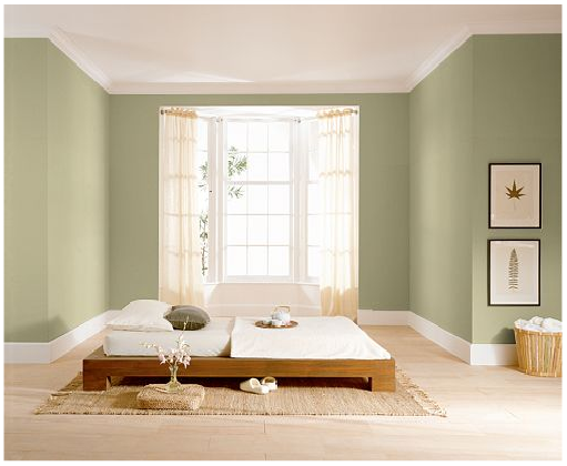
Then I found Wasabi Powder. It looks scarily similar to Tea Bag on this preview but in real life they are actually very different. Wasabi Powder is much more green, and less yellow. I took a leap of faith {and a deep breath} and bought two gallons. I brought it home to my main squeeze and he was thrilled and I was able to breath a huge sigh of relief.
So, "What are you going to do with $60 of Antique Tin paint?" you ask? Well hopefully soon, the boys will be able to remodel the basement into their theater room sooner rather than later and dark gray paint will be perfect! In the meantime, it can keep us company and we can tell the funny little story of the gray paint that wasn't.
Have you guys ever had a stalemate over a paint color in your home? Dish it, Nesters! <3


Wow - pressure!! I love your office colour. SO pretty. I'm excited to see your other choices on the walls too. You must be feeling more relieved.
ReplyDeleteI never had a husband or boyfriend who cared one bit about making any decorating decisions...as long as I promised not to make things too feminine. I think guys today are a lot more invested in how their homes look, and that's a good thing. Joint decisions take a bit more time, but in the long run, it insures that both people enjoy their surroundings...and that kind of compromise is good practice for some of the larger decisions a couple has to face.
ReplyDeleteTanya- I am seriously relieved. Andthe best part is that its just paint. Nothing that can't be fixed if we end up hating it. :)
ReplyDeleteDana - I totally agree. And we really do see eye to eye on most decor choices so there has yet to be a disagreement. (Knock on wood) I did realize that i dont like making choices for the both of us. I value his input momentously. Hopefully all the choices we make together will be as easy as paint!
I am actually a lot more boring with my paint color choices than my husband!
ReplyDeleteOne thing we do before tackling a huge project is buy a sample, paint a piece of poster board with it, and then hang it in each room to see how it looks with the light. Saves a lot of repainting.
Good luck with your wasabi!!